
One of my favorite projects from the recent past is this entry hall/living room remodel which was part of a larger whole-house master plan and renovation. This client has a lovely Lake Oswego home which she bought to be closer to family. It’s a generously sized home whose last owners had owned it for many years. It needed updates but there were also a few layout conundrums that needed looking at. We walked through her entire home and discussed all her ideas, hopes, dreams and frustrations and started working through each one.
One thing that she was frustrated by was the living room layout. It was just really hard to put furniture in the space – could we help with that? Adjacent to the living room was the front door and entry hall. This space felt cramped and “wrong” somehow. What’s wrong with it? Can we fix it?
First, we spent some time examining the living room and possible furniture layouts. It has a centered fireplace on one end and a centered bank of large windows on the long wall facing the street. It has an entry point right smack at the front door – the corner of the room. And an “exit” point opposite into the dining room. So, the circulation (walking path) has to cut across the floor. The hall had a huge closet taking up most of the space. While it’s great to have that much closet at your front door, when you walked in you were confronted with the corner of the closet and were already almost standing in the living room. The hall past the closet felt very narrow for this entry so the whole thing ultimately felt cramped and awkward. Here’s some floorplans to give you a sense of it.
FIREPLACE FOCUS
In this furniture layout test, we see if a focus on the fireplace will work. This is similar to how the client had her living room organized when we arrived but it was clear that things just weren’t fitting very well. Here’s our problem spots, annotated in green and described below:
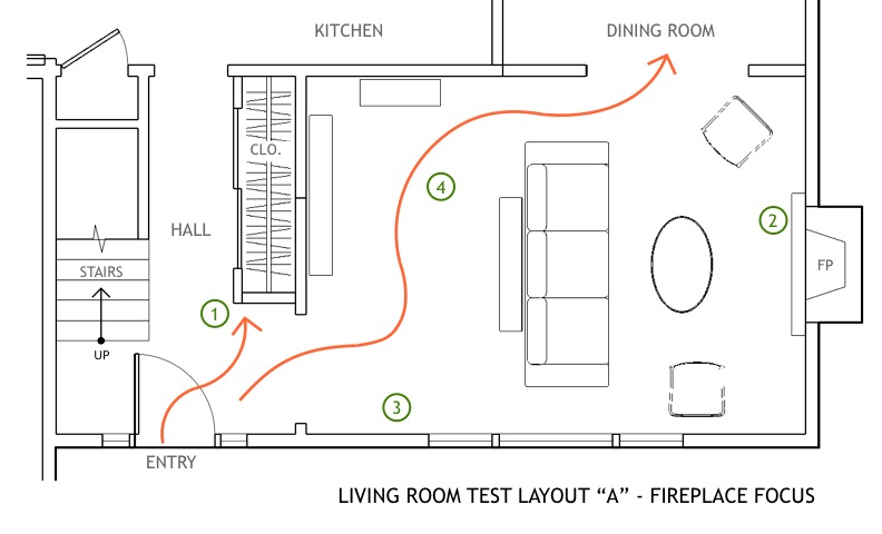
- Crowded entry. Walking in the door, you naturally move to the right and are confronted with the corner of the large closet.
- Focus on the fireplace. This grouping actually looks fairly cozy but completely ignores the windows.
- Difficult zone. Because of the entry from the front door, this is a difficult area to put furniture or storage without feeling like it is blocking the entry and is tricky to balance where to place anything given the location of the windows.
- Circulation must cross the space completely. Because you need to get across the whole of the room, this entire area here must remain open. It feels overly spacious and underutilized.
WINDOW FOCUS
In this layout we see if a focus on the window wall works. The windows are big and beautiful and centered on the long wall. Here’s our problem spots, annotated in green:

- Crowded entry. Again, the closet corner pinch point!
- The fireplace gets ignored as a focal point in favor of the windows.
- Furniture placed here starts to feel like it is blocking or crowding the entry from the hall into the living room. You could do a smaller couch but that would likely feel too small for the space.
- Again, the circulation must cross the space completely. This feels a little bit better than layout “A” but still creates a spacious “dead zone” where placing additional furniture or storage starts to feel awkward or disconnected.
NEW FLOORPLAN
Once we thoroughly analyzed the issues, we worked to find some solutions using our best space-planning skills and experience! Here’s what we came up with:

- First major move was to change the way you entered the living room from the hallway. So we “moved” the entry point away from the door, creating a wall return that offers a spot for a side table “landing zone” with a mirror above. This little wall also provides a “protection zone” for the couch and other furniture so that they feel out of the way of the main circulation. We then made the closet smaller. I know some of you are aghast at the idea of making an entry closet smaller but there are other storage areas in the home and this size is appropriate for daily coats and shoes (and would still be the envy of some of my small home clients!). So, the entry point now becomes a widened opening centered on the fireplace.
- Second major move was to widen the entry to the dining area. This was something that my client already wanted to do and she had good instincts about that. For the living room, it shortens that circulation path from entry into dining. The change also gives much greater views into the dining area and from the dining into the living area. More natural light spills out all around and that’s a good thing!
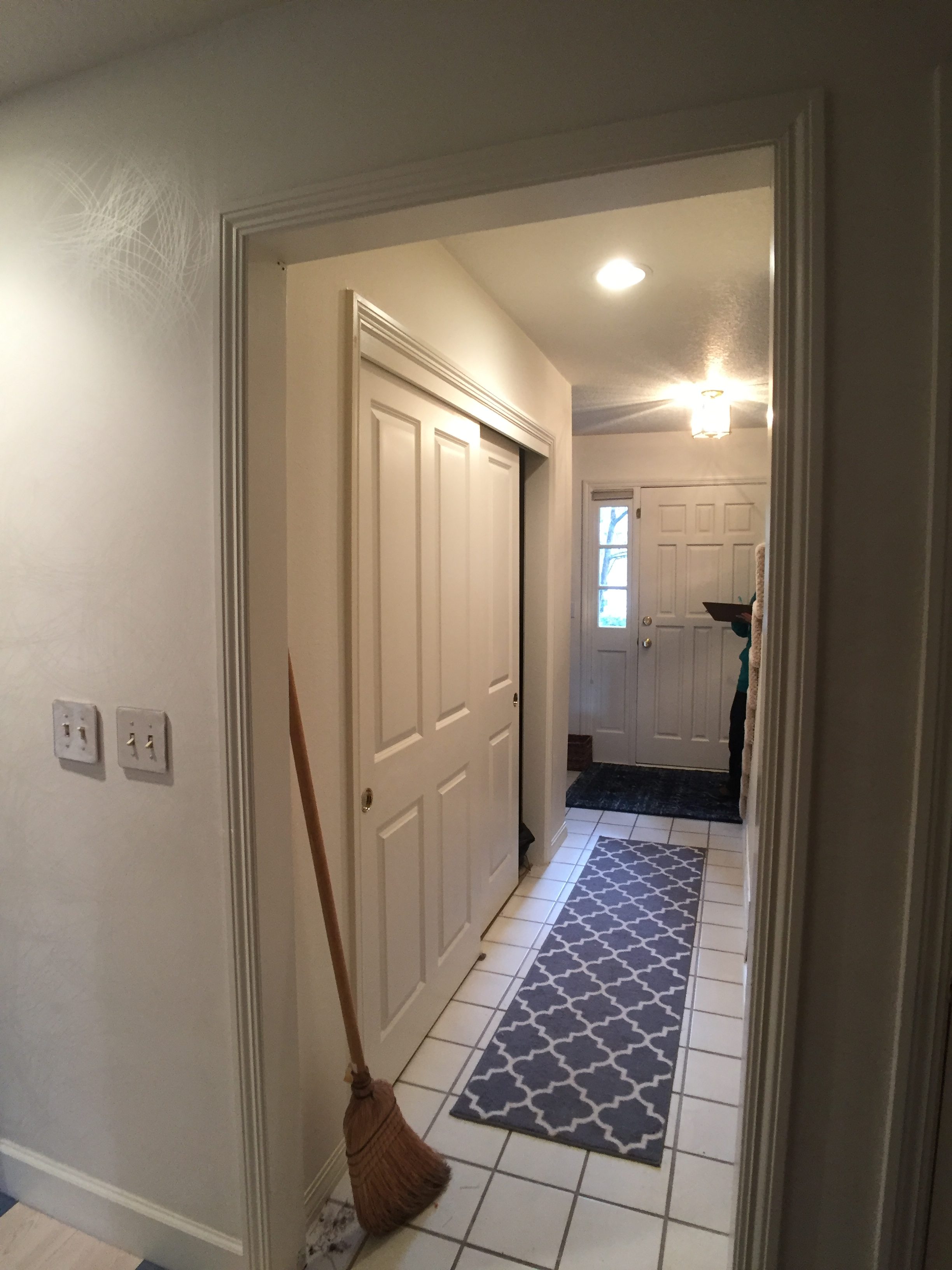
ENTRY HALL BEFORE

ENTRY HALL AFTER


The project also included all new flooring on the main floor. The new view from the living room nicely framed the stair and it was clear that the stair and bannister needed a refresh so that was added, too!
The entry hall now feels less like a cramped space to pass-through and more like a proper foyer leading into a living room with balance. And…no one will ever know it was any different because it truly feels exactly how this space was meant to be!
Completed: 2018
Project Designer: Amanda Erickson, PDX Additions, LLC
Interior Designer: Christina Tello, Tello Interiors
Contractor: Derek Brown, Crystal Remodeling
Photos: Kelly Wilde, June Lion Photography